We will learn how to build good looking TabBar with and without AppBar
Download the starter code from the link below
Flutter Tab Bar Without App Bar
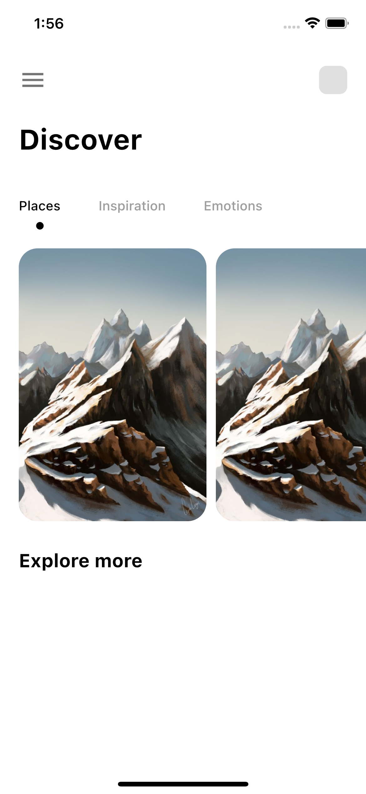
This is what we are going to build. Let's take a look at the picture. You can find the complete app tut here

From the above photo, we can see that we will three tabbars. We don't have any app bar in this example.
We will have to know the idea about two things.
√ TabBar
√ TabBarView
√ Controller for TabBar and TabBarView
TabBar
It takes list of children. The property is tabs. For tabs we can use tab widget or any other wideget within it.
TabBar(
  ............
  ............
  tabs:[
  Tab(.....),
  ............
  ]
)
TabBarView
It takes children just like TabBar. These are children would be shown when you tap on the TabBar tabs.
TabBarView(
  ............
  ............
children:[
   ................
   ............
  ]
)
For doing this we will simply just create two Containers (Container() widget). You may not put them in the Container() widget. You can style them anyway you want. One Container() for holding the tabbars and another Container() for holding view for the TabBar which is TabBarView.
Look at the TabBar in the first Container()
Container(
            ......................................
            ......................................
            child: Align(
              alignment: Alignment.centerLeft,
              child: TabBar(
             .....................
             .....................
                tabs: [
                  Tab(text: 'Places'),
                  Tab(text: 'Inspiration'),
                  Tab(text: 'Emotions'),
                ],
              ),
            ),
    ),
In the Container() we have TabBar and TabBar takes tabs list. You can put as many children in the list. Children could be Tab or any kind of widget.
Look at the second Container() for TabBarView.
Container(
            padding: const EdgeInsets.only(left: 20),
            height: 300,
            width: double.maxFinite,
            child: TabBarView(
              controller: _tabController,
              children: [
                ListView.builder(
                    scrollDirection: Axis.horizontal,
                    itemCount: 5,
                    itemBuilder: (_, i) {
                      return GestureDetector(
                          onTap: () {},
                          child: Container(
                            width: 200,
                            height: 300,
                            margin: const EdgeInsets.only(
                                right: 10, top: 10, bottom: 0),
                            decoration: BoxDecoration(
                              borderRadius: BorderRadius.circular(20),
                              image: DecorationImage(
                                  image: AssetImage("img/mountain1.jpeg"),
                                  fit: BoxFit.fitHeight),
                            ),
                          ));
                    }),
                ListView.builder(
                    scrollDirection: Axis.vertical,
                    itemCount: 5,
                    itemBuilder: (_, i) {
                      return GestureDetector(
                          onTap: () {},
                          child: AnimatedOpacity(
                              opacity: animation.value,
                              duration: Duration(milliseconds: 2000),
                              child: Container(
                                width: 200,
                                height: 300,
                                margin: const EdgeInsets.only(
                                    right: 10, top: 10, bottom: 0),
                                decoration: BoxDecoration(
                                  borderRadius: BorderRadius.circular(20),
                                  image: DecorationImage(
                                      image: AssetImage("img/mountain1.jpeg"),
                                      fit: BoxFit.fitHeight),
                                ),
                              )));
                    }),
                Material(
                  child: ListTile(
                    leading: CircleAvatar(
                      backgroundColor: Colors.grey,
                    ),
                    title: Text("Content"),
                  ),
                ),
              ],
            ),
          )
Here the TabBarView also takes list of children.
Flutter Complete Shopping App With Backend
Controller
At the same time, it also needs a controller. We need to create a controller for TabBar. You can create it within your initState() class or somewhere it's easy to initialize.
TabController _tabController = TabController(length: 3, vsync: this);
Indicator
For indicator property if you want to use custome desgin you need to implement it using Decoration widget. It means your custom widget should extend Decoration.
And if you extend Decoration, you should implement and override createBoxPainter method. And then createBoxPainter should return a widget.
And this widget should extend BoxPainter. and at the same time this returned widget must implement and override paint method. See the skeleton
class CircleTabIndicator extends Decoration {
 final Color color;
  double radius;

  CircleTabIndicator({required Color color, required double radius})
  //override createBoxPainter

  @override
  BoxPainter createBoxPainter([VoidCallback? onChanged]) {
    return _CircelPainter();
  }
}

class _CirclePainter extends BoxPainter {
 ...............................
 ...............................

//override paint

  @override
  void paint(Canvas canvas, Offset offset, ImageConfiguration cfg) {
  ......
  }
}
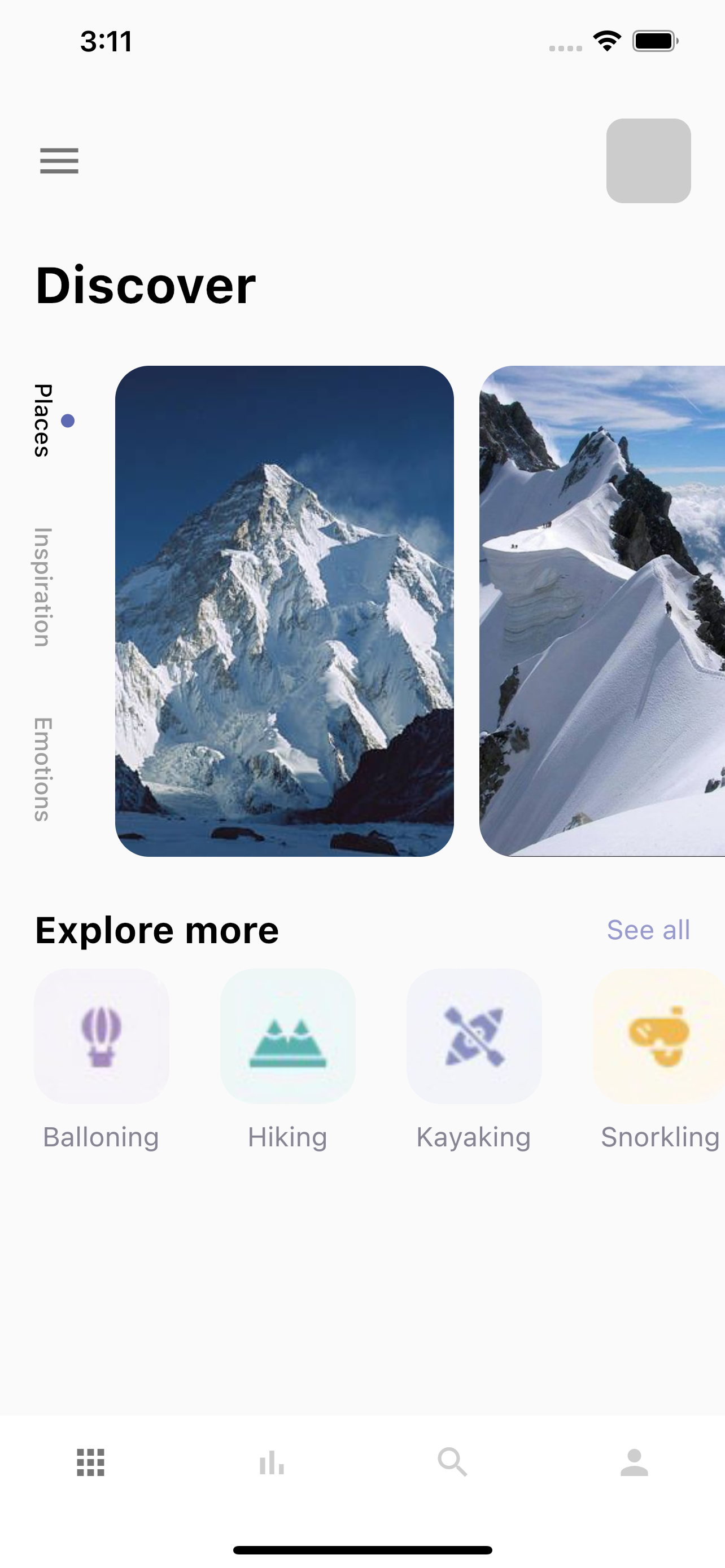
Vertical TabBar

Three things we need to do.
√ Wrap your TabBar inside RotatedBox and set quarerTurns:1
√ Put those two Container() (TabBar and TabBarView) inside Flexible
√ Put Flexible inside Row() widget
If you want your TabBar to be Vertical you must put the TabBar inside RotatedBox() widget as a child.
If you want your TabBar to be vertical, then you need to put those Container()'s(TabBar and TabBarView) insde Flexible widget, this is because we need to take all the available space. And we also need to mention the contraints, the limits of your widget. Here by limit I mean width.
And then wrap your Flexible widget in side Row() widget. Row takes unlimited bound or space. Now Flexible will take unlimited bound too or unlimited width.
Flexible widget always needs to constrains(width or height) of it's parents, whether it's limited or unlimited.
Vertical TabBar Complete Code
 Row(
                  children: [
                    RotatedBox(
                      quarterTurns: 1,
                      child: Container(
                        child: Align(
                          alignment: Alignment.centerLeft,
                          child: TabBar(
                              labelPadding: const EdgeInsets.only(left: 20, right: 20),
                              controller: _tabController,
                              labelColor: Colors.black,
                              unselectedLabelColor: Colors.grey,
                              isScrollable: true,
                              indicatorSize: TabBarIndicatorSize.label,
                              indicator:
                              CircleTabIndicator(color: AppColors.mainColor, radius: 4),
                              tabs: [
                                Tab(text: "Places"),
                                Tab(text: "Inspiration"),
                                Tab(text: "Emotions"),
                              ]),
                        ),
                      ),
                    ),
                    Flexible(child: Container(
                      padding: const EdgeInsets.only(left: 20),
                      height: 300,
                      width: double.maxFinite,
                      child: TabBarView(
                        controller: _tabController,
                        children: [
                          ListView.builder(
                            itemCount: info.length,
                            scrollDirection: Axis.horizontal,
                            itemBuilder: (BuildContext context, int index) {
                              return GestureDetector(
                                onTap:(){
                                  BlocProvider.of<AppCubits>(context).detailPage(info[index]);
                                },
                                child: Container(
                                  margin: const EdgeInsets.only(right: 15, top: 10),
                                  width: 200,
                                  height: 300,
                                  decoration: BoxDecoration(
                                      borderRadius: BorderRadius.circular(20),
                                      color: Colors.white,
                                      image: DecorationImage(
                                          image: NetworkImage("http://mark.bslmeiyu.com/uploads/"+info[index].img),
                                          fit: BoxFit.cover)),
                                ),
                              );
                            },
                          ),
                          ListView.builder(
                              itemBuilder: (context, index){
                                return ListTile(
                                  leading: Icon(Icons.account_circle),
                                  title: Text("Line "+(index+1).toString()),
                                  selectedTileColor:Colors.green[400],
                                  onTap: () {
                                    setState(() {

                                    });
                                  },
                                );
                              }),
                          Text("Bye")
                        ],
                      ),
                    ),)
                  ],
                ),
Here if you don't use Flexible widget correctly, you will get the following error
The overflowing RenderFlex has an orientation of Axis.horizontal.